Truffle Pig Branding
Branding for a marketing company targeting younger demographics founded as a partnership between SJR, Snapchat, and DailyMail. Our team was given the direction that the logo had to be a depiction of a pig and executed in a mono-line style.
Logo Development Process
My design process began with pencil sketching and drawing outlines of pigs before scanning them into Adobe Illustrator. Once I had some semblance of a pig in a digital space to work with, I iterated numerous times on the the shape and form of the pig. At the same time, I also experimented with different ways of abstractly representing a pig, such as only showing its head or simply its nose. Several times I reverted to working in solid fills rather than lines in order to better focus on the shape of the pig.
Throughout the length of the project, I had to continuously think about the typeface of the logo as I worked on pig drawings. This meant being very conscious of where type could sit or lock up with the logomark as I iterated. As seen below, type appeared early on in the process and filtered in and out of my drawings as I reconsidered its placement.
Quick pencil sketches of pigs provided a framework to work with in vector form. Other initial development included exploring greater abstractions of a pig.
Beginning experiments with typefaces to pair with the logomark also shown here.
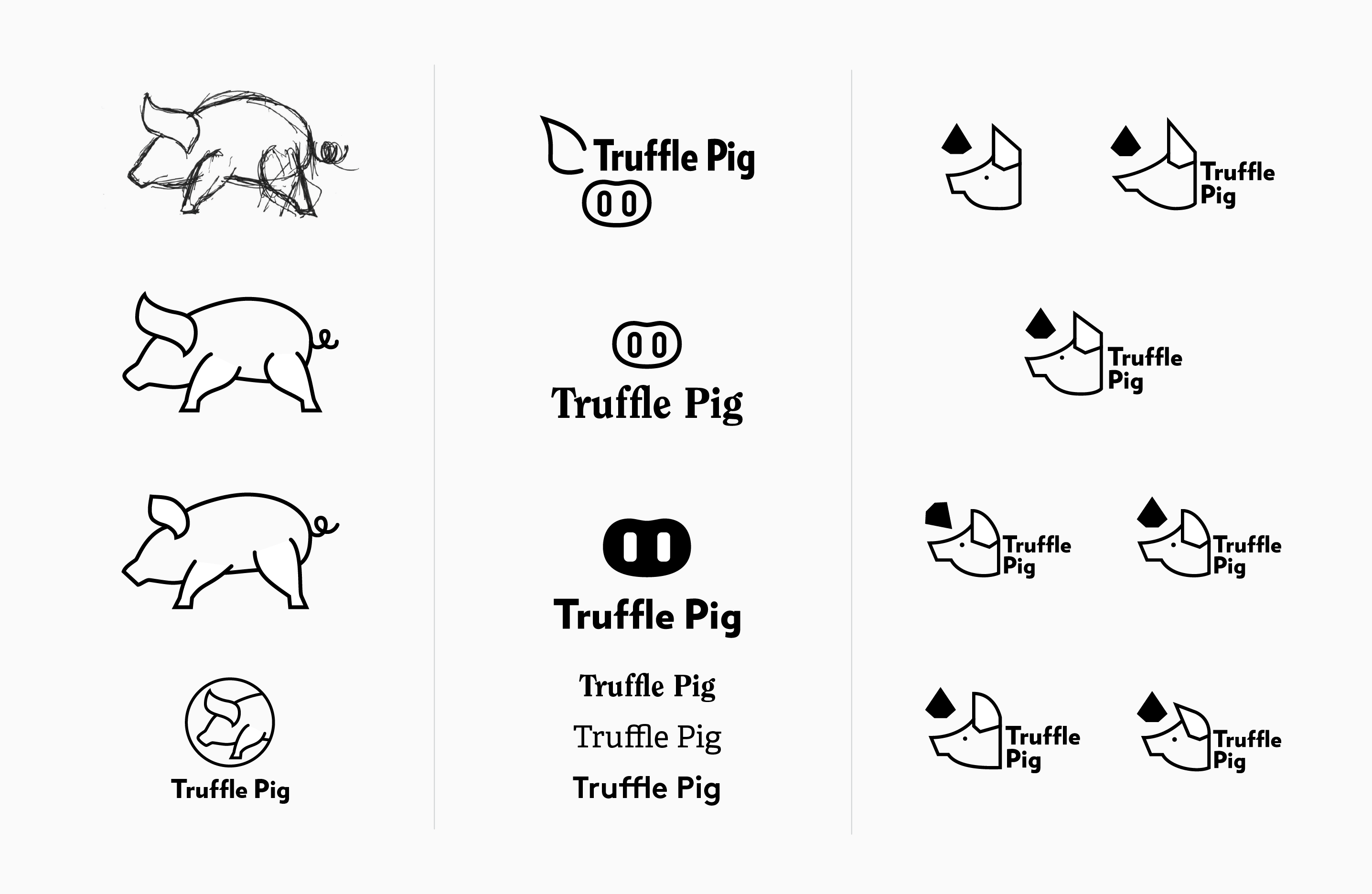
Continued iterations of pig drawings; including ones in solid fills.
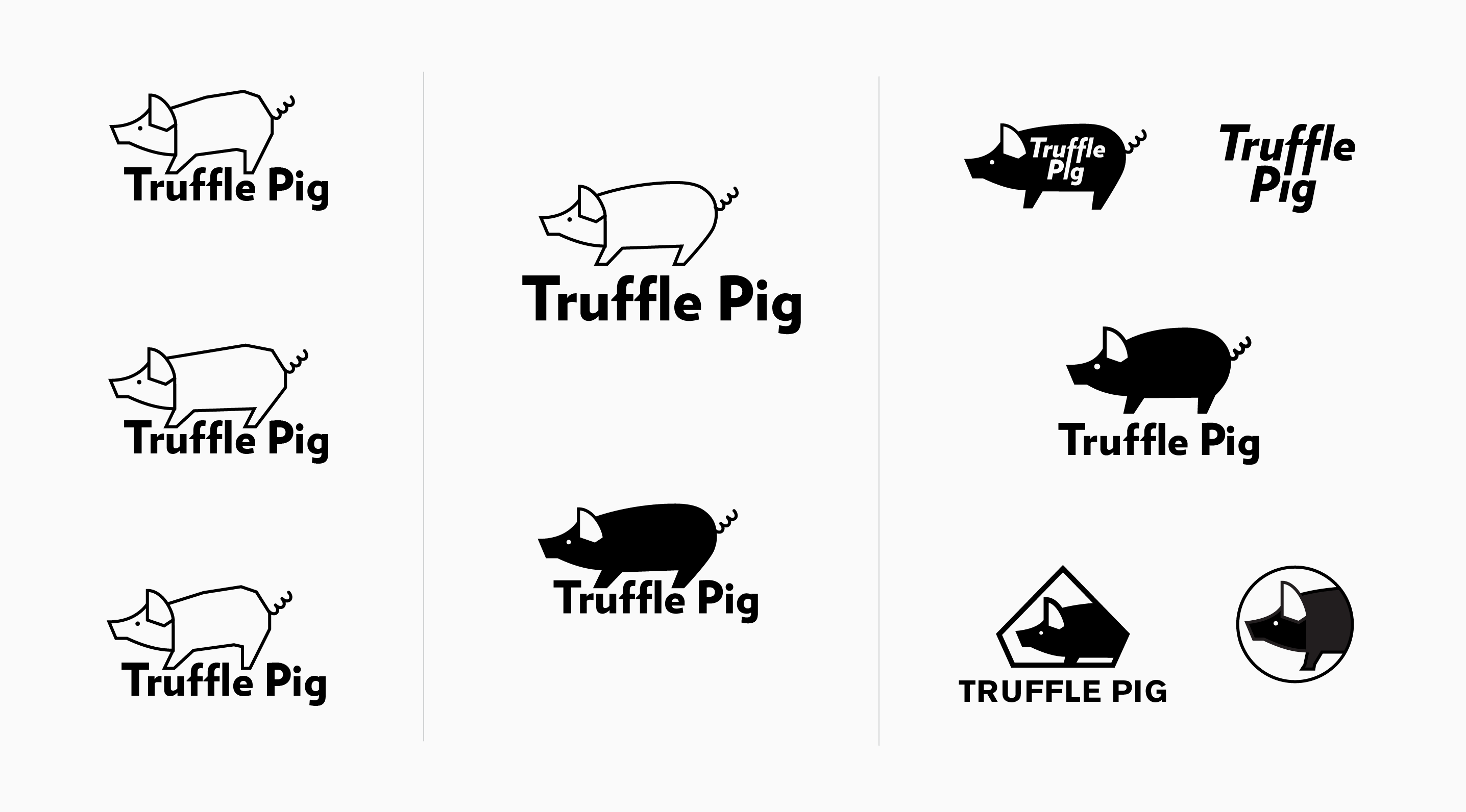
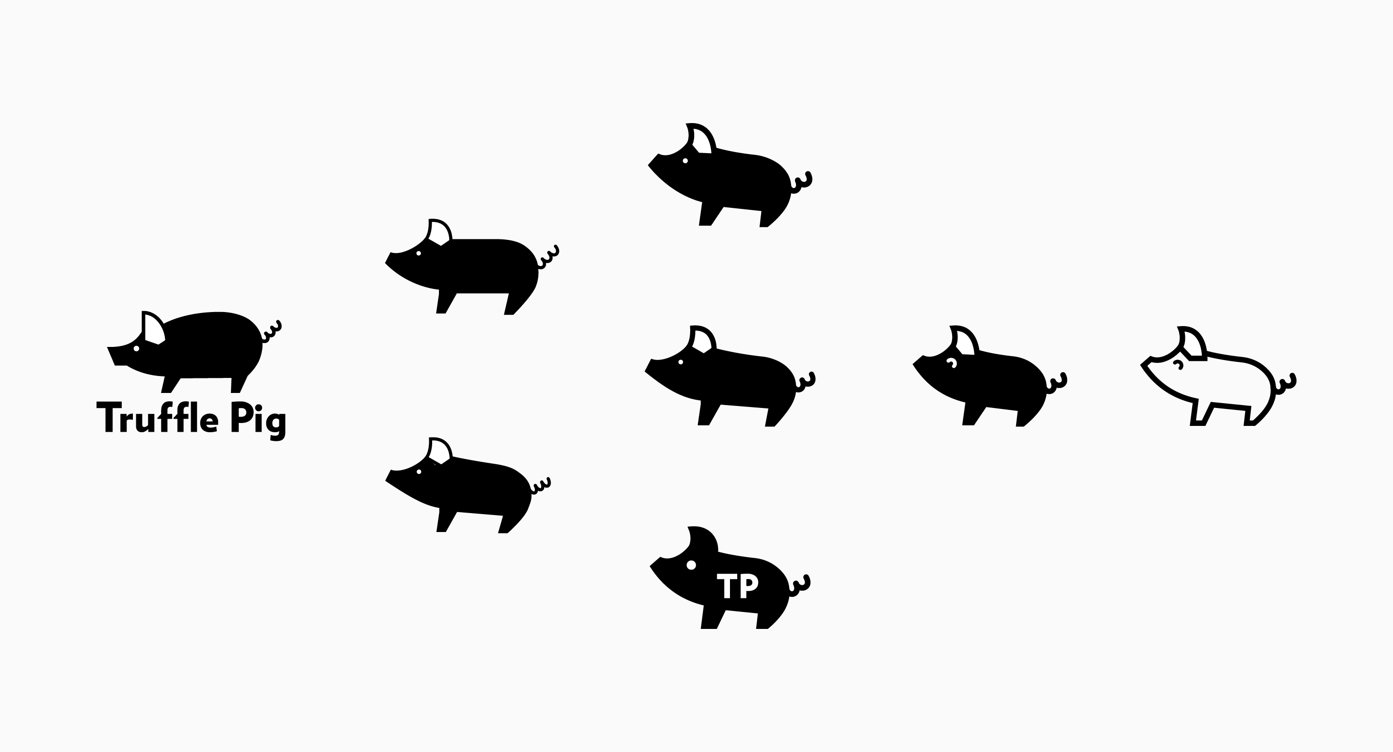
After many rounds and iterations, I realized that the kind of pig I was illustrating—a fully grown adult pig—was working against what I wanted to achieve. A larger, fully grown pig felt too aggressive and related too much to the idea of a butchershop at worst and a restaurant at best. I decided to take my original drawings and morph them into ones closer to a piglet: I made the head larger, shortened the legs, and changed the sizing, shape, and placement of the ear. This dramatically altered the feel of the logo and helped in simplifying the pig down to its most basic, recognizable features.
With most of the logo drawn, I began paying greater attention to finding a typeface that could work well with the icon. I initially wanted to pair the logo with a serif in order to tone down the youthfulness of the pig illustration.
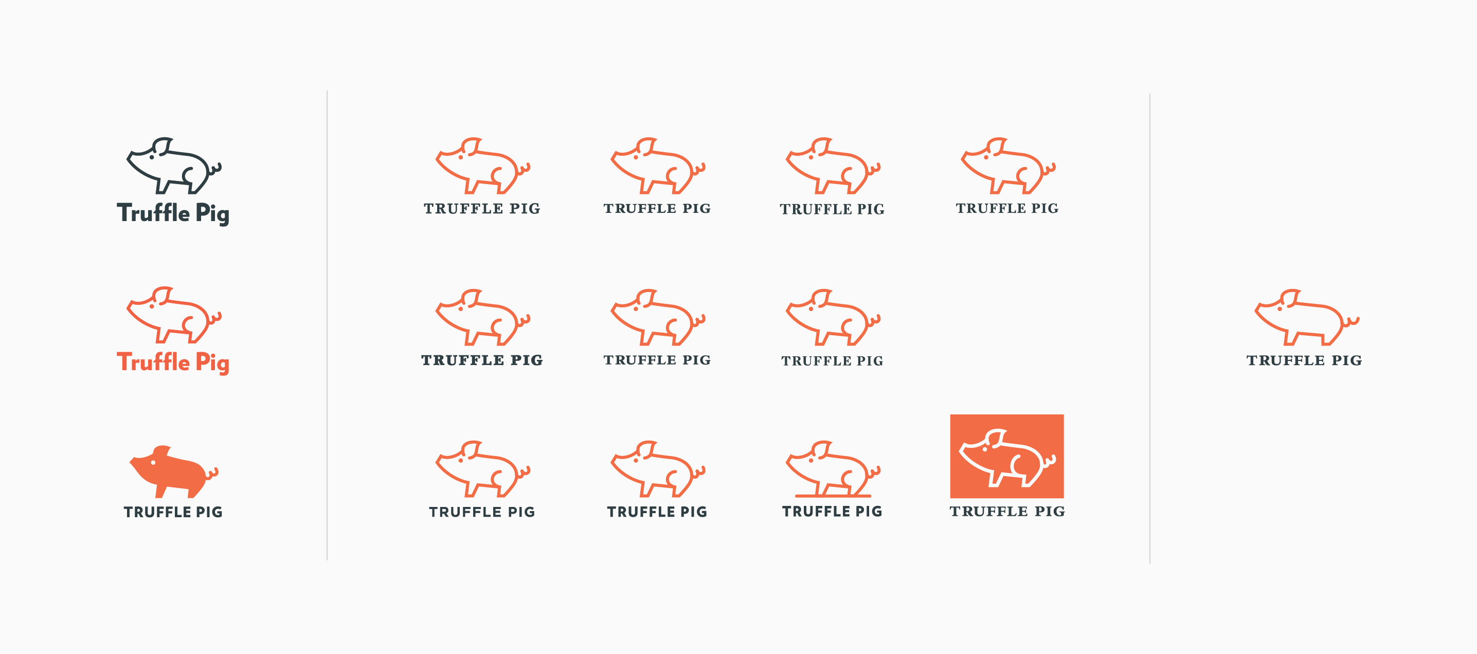
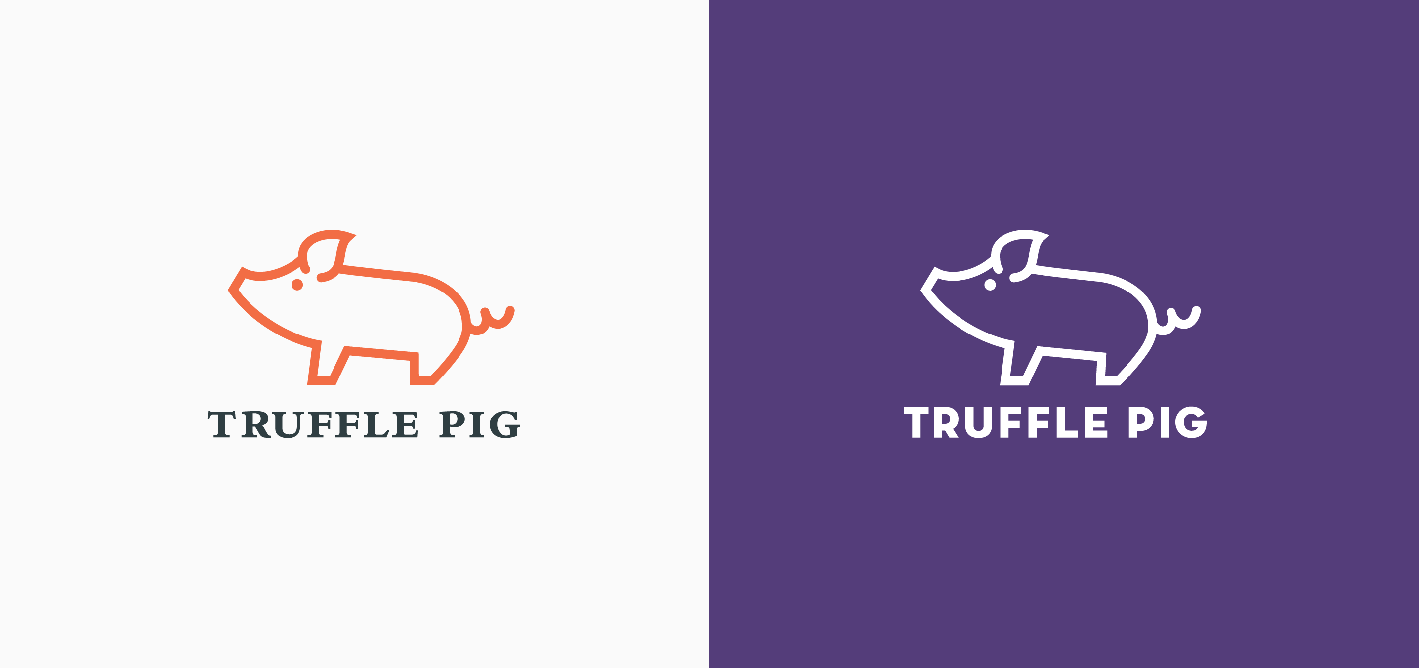
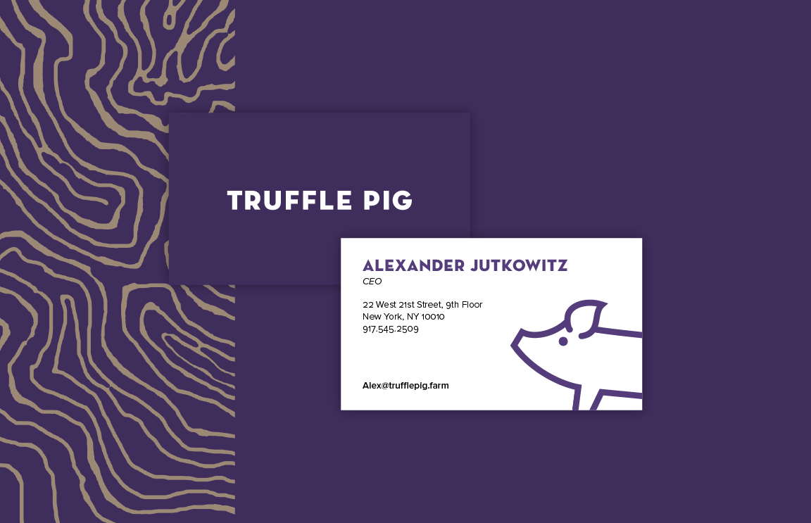
Final tweaks to the logo. I reverted to a sans serif as it better matched the line style of the pig drawing. The pig's body was also shortened and the primary color changed from orange to purple.
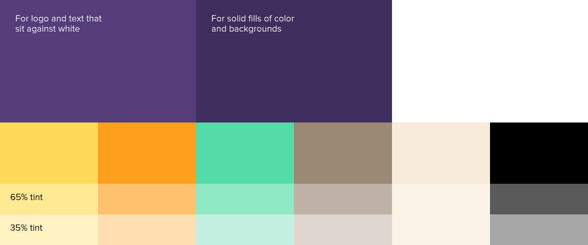
Colors
Color palette with swatches pairing the colors found in truffles with more youthful, web-inspired hues.
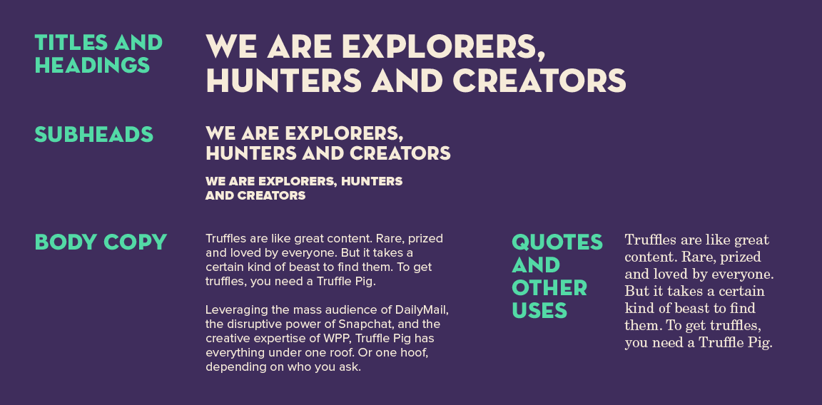
Typography
Truffle Pig's identity utilizes Neutraface Display Titling for impactful headlines with Proxima Nova for smaller subheads and body text. New Century Schoolbook is used in places where a serif pairing and sensibility is needed.
Graphic Elements
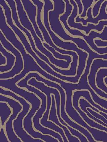
Line icons inspired by the monoline Truffle Pig logo. Truffles are abstracted into solid symmetical blobs. Patterns based on cross sections of truffles were also created as additional design elements.
Icons.
Truffle pattern.
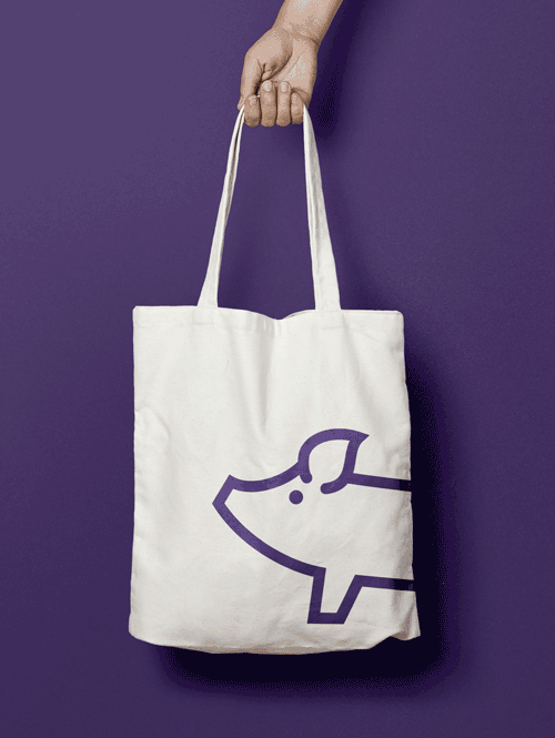
Applications
Business cards.
Tote bags.
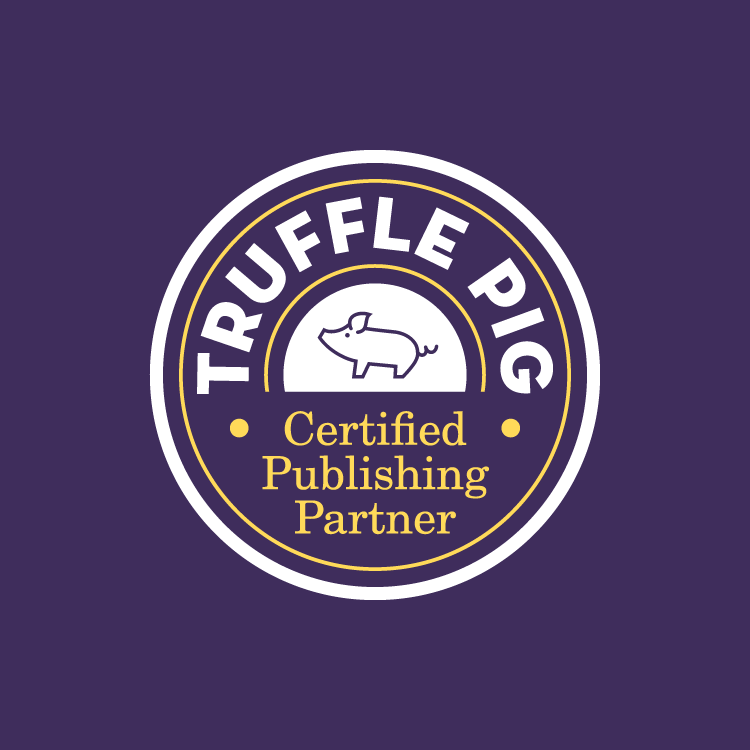
Partnership stamp.